OLFACTORY
An e-commerce website prototype for niche fragrances with detailed scent descriptions
Hailey Meyers, Nia Montgomery, Amina King, Zaria Howard
Timeline
Sep - Nov 2023
Team
UX Designer, UX Researcher
Role
Tools
Teams, Discord, Figma, FigJam
Overview
The Problem
The Method
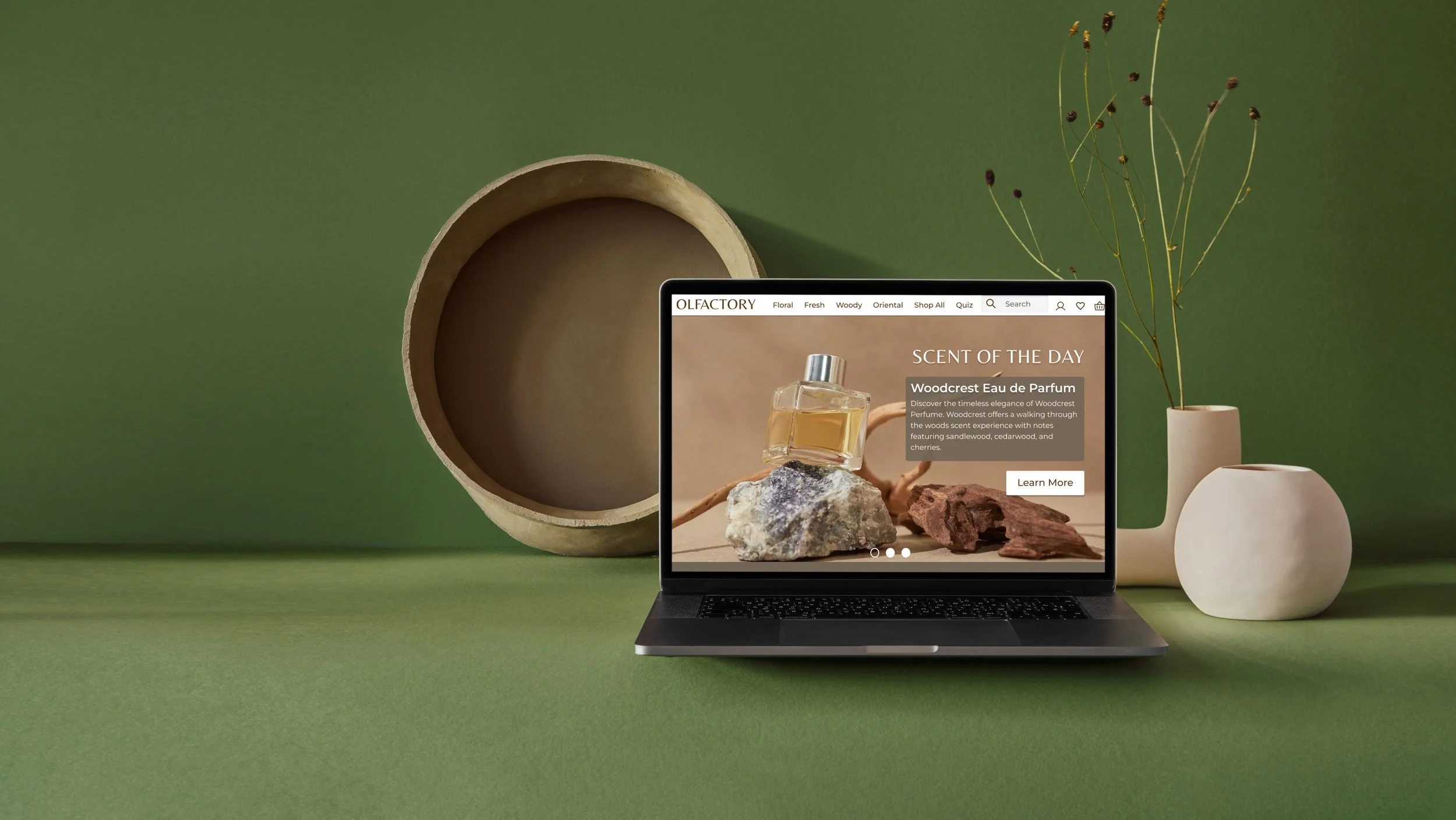
Olfactory is a website prototype that helps assist users in discovering (and purchasing) their signature scent.
During my Interactive Design II class in fall 2023, I worked alongside 3 others to create an experience that makes fragrance knowledge accessible and inclusive outside of the binary constraints of the current fragrance industry.
Perfume and cologne are essential to most people in their daily routines, yet few people can truly pinpoint what scents they enjoy and work well with them naturally. This lapse in knowledge is the perfect entrance for major perfume sellers to push a couple of trending scents to millions, crushing the ability to be unique.
Another problem we came across was how fragrances are presented. Colognes being exclusively male and perfumes being exclusively female felt too limiting, and we could see that a sense of neutrality when presenting fragrances could prevent users from limiting themselves in their search for a scent that really feels personal to them.
This project followed a modified version of Lean UX. Embodying the concept of “lean”, this method makes use of time constraints by creating a cycle of hypothesizing, creating, and user research/testing in time blocks referred to as “sprints”.
We did 2 sprints both consisting of 3 weeks. As a small group of designers limited to this class, we worked on business outcomes and research to the best of our ability.
The first week of creating Olfactory consisted of setting up our Lean UX canvas, or in other words, we started by creating our initial assumptions and brainstorming solutions. Our problem statement was: What existing products/services fail to address is including customer personalization, detailed product descriptions, and diversity. Our product will address this gap by providing a variety of diverse and niche scents for everybody regardless of gender and budget.
Sprint 1
With this we created Stacy and Noel, our proto-personas. We used these amalgamations of assumed needs and wants to start shaping aspects of the website. Through user testing and iterations, these personas are built to adapt to better understand our user.
With our personas in mind, we ran our brainstormed solutions through tests to rank the risk factor of our ideas. This showed us that our main focus should be on creating a fragrance quiz and developing a page for detailed fragrance descriptions. Both of these features should help bridge the knowledge gap that Stacy and Noel have to more confidently choose a fragrance.
Week 2 consisted of 2 interviews to gain insight on what experiences and knowledge regarding fragrance different users could come into our website with.
Our main takeaways from these interviews were that users would value detailed descriptions to better learn about their fragrances and asking questions in-store feels like a hassle to some.
The last week of Sprint 1 we began work on the first aspect of focus, the fragrance quiz, as well as the home page and sign-up. I designed the sign-up page and wrote the questions for the quiz. User testing of these showed us…
With Sprint 2, we circled back to our initial assumptions to compare and update accordingly. Our main discovery was that while our personas' needs didn't change much at all, our main persona was no longer Stacy, but Noah. This meant to focus on users with less fragrance knowledge, and those more interested in finding something gender neutral.
Sprint 2
We then looked at our Sprint 1 backlog, cut out some features that were no longer needed, and then shifted to our next focus, the product pages and descriptions. We also finished up the quiz and designated it as onboarding before sign-up.
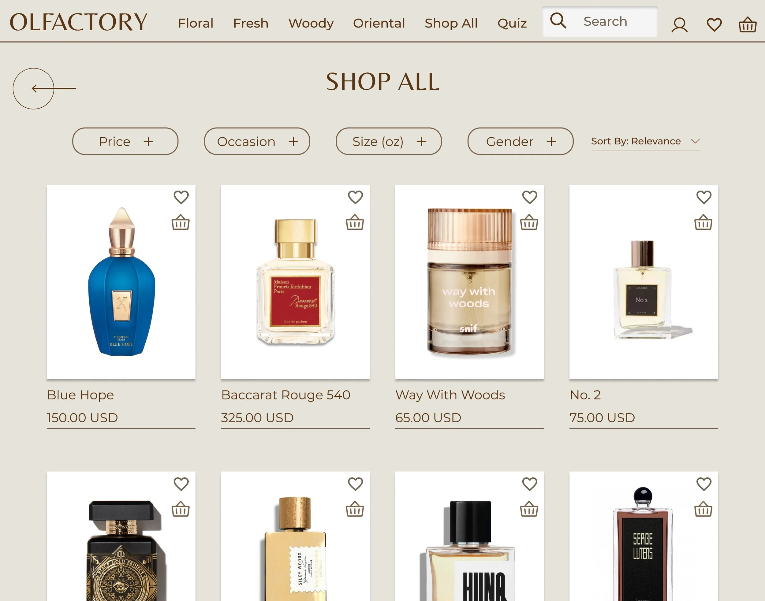
In the second week, I designed the “all products” page and filters to sort through the page by category and price. This page could then be duplicated into the other categories’ pages. After user testing this week, our main takeaways were:
Put a button for the quiz in the navigation for easy access
Add more description to our layering recommendations
And some general UI edits for usability
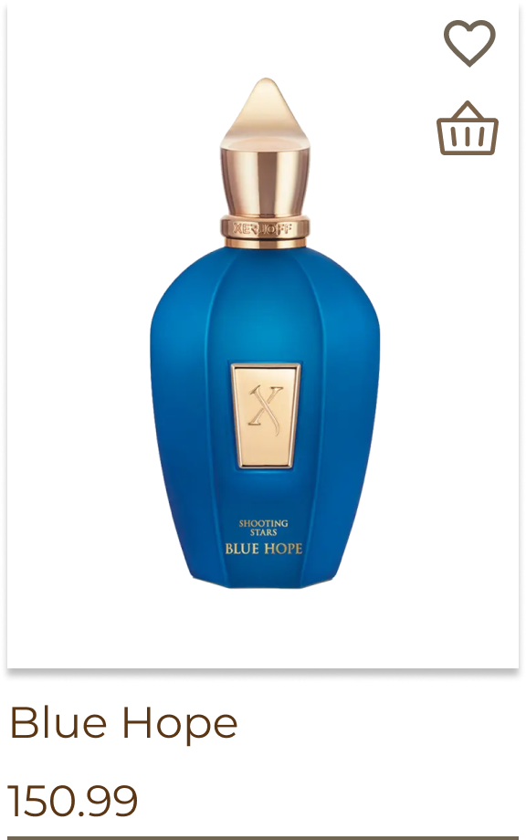
For the third week of Sprint 2, we prototyped the user flow and made some refinements with auto-layout. We met in-person in order to connect our pages collaboratively but my focus was on the page filters, product cards, and the “floral” products page.
After the 2 sprints, we took one week to polish off anything out of place and ensure that our product looked ready-to-go. Not much was done and I just made updates to the filters.
The Solution
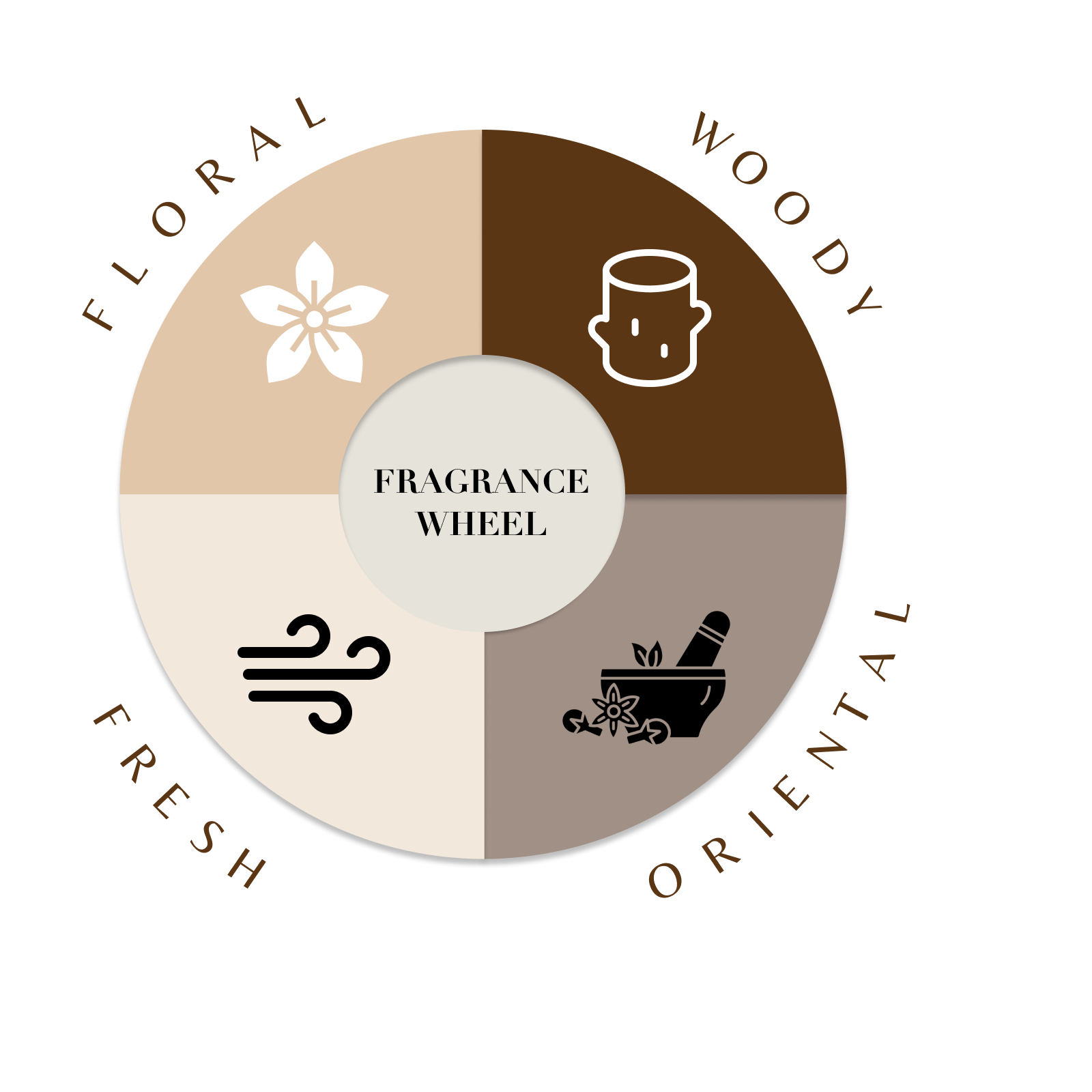
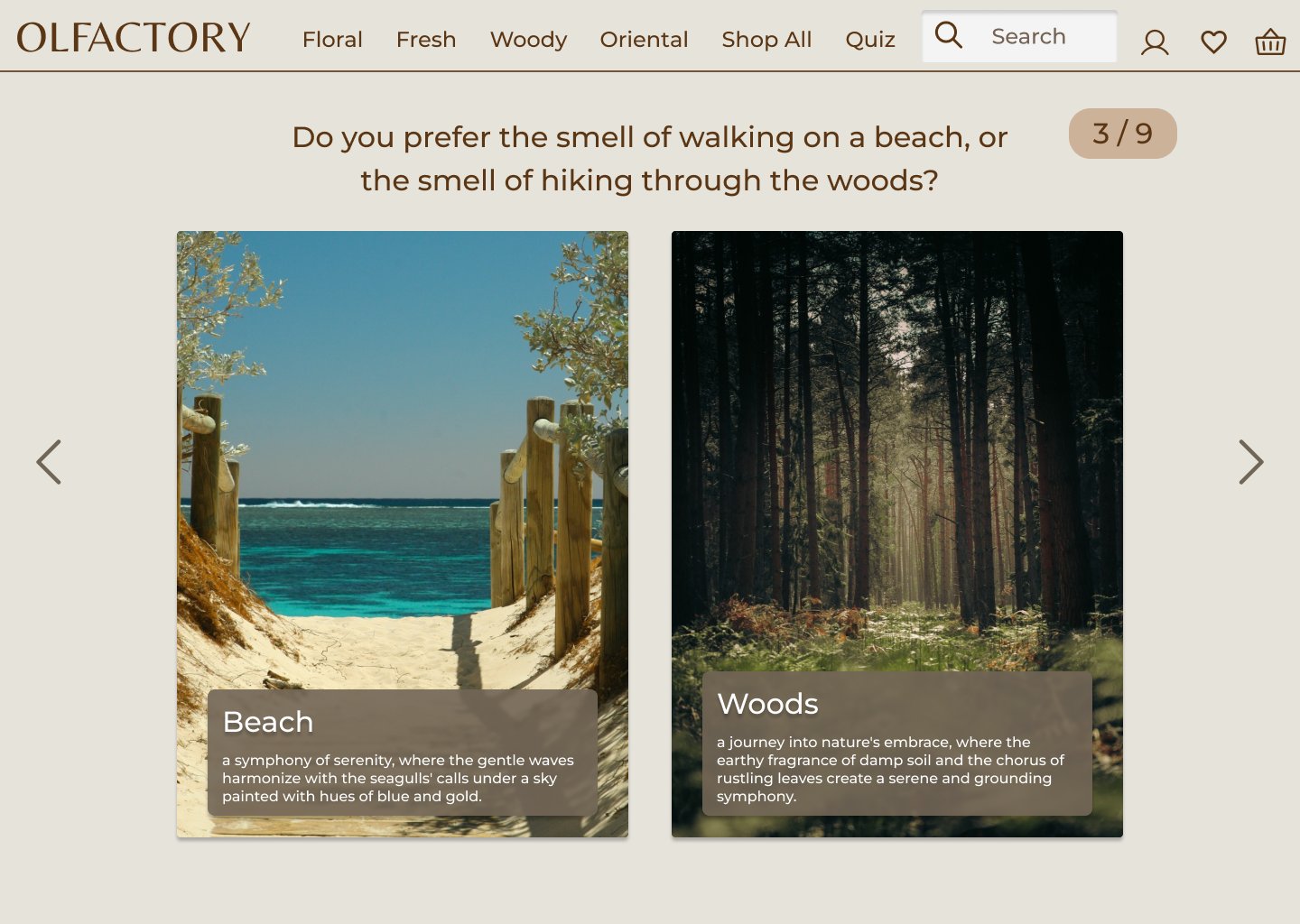
When users enter the Olfactory website, they’re met with a prompt to start our fragrance quiz. For our results we relied on the wheel of basic fragrance types to narrow down their search and put a name to the scents they gravitate to.
Our products are categorized by their type, so that users after knowing their quiz results can visit that category and browse fragrances. Each product listing is also coupled with its own page of detailed descriptions, allowing for further education on its scent profile/notes, best occasions to wear it, and price.
Reflection
This was all of our first rodeo with Lean UX, and with that came some pain points to note:
Starting with personas and then interviews cause us to sometimes ask leading questions
The quick movement of the sprints exposed some time-management issues we all had
I learned that breaking Sprints into full focus on MVPs and then full focus on user testing instead of trying to mix the two throughout the weeks keeps everyone on the same page and boosts productivity.
The testing showed that the website was easily understood and the quiz proved to be useful in guiding users. However, it would have been appreciated to flesh out the screens and flows to be a more fully functioning prototype.
On a personal level, I found myself struggling with confidence. Often, I would have ideas and critiques that never left my own brain because of uncertainty of how well received they would be.
Overall, I enjoyed working on this project and felt like the vision we had comes through in our product.
